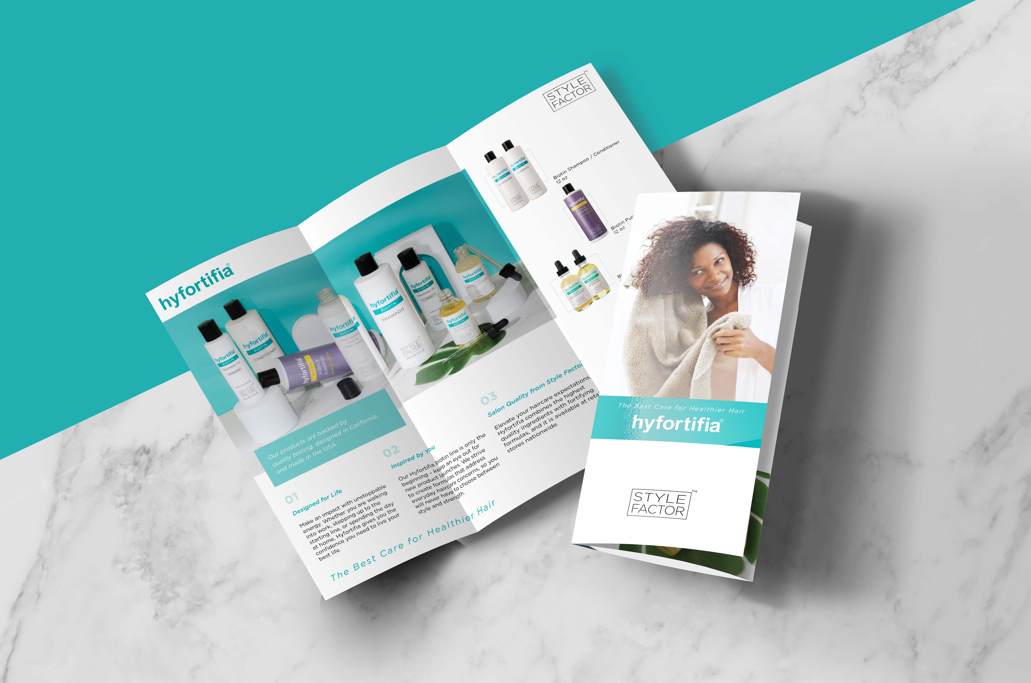
Joining and working as a part of Style Factor, the number one company in the hair care industry, was a wonderful experience for me. It allowed me to observe the products our team created and designed spreading across beauty stores in the United States.
The company aimed to help customers choose hair products based on their hair type, preferences for product use, and styling.
Project Type
Advertising
Social Media Contents
Photography
Package Design
Publication Design
Logo motion graphic
Role
Graphic Designer
tool
Adobe suites
Figma
Maze
Optiomal workshop
Overall Contribiton Rate
100%
Proactively took charge of design and execution
Banner design
When the new products were launched, I was captivated by their beautiful colors and textures, perfectly tailored to customers' individual hair type preferences. This led me to empathize with users and brainstorm creative ways to showcase the product to the world. Creating banners after personally experiencing the products added a delightful and enjoyable dimension to the entire process.
SNS Posting Design
Empathizing with products was crucial not only for connecting with users but also instrumental in expanding ideas for creating engaging social media posts. This approach proved successful, as the company garnered over 10,000 followers within just four months of launching its Instagram account.
All the postings I designed utilized my photography skills, and this project expanded my skill set beyond photography to include typography, layout, and color theory. It brought me joy to witness the reactions and expressions of followers on the account.


Additionally, the company opted to publish advertisements in Vogue and ELLE magazines, and I had the opportunity to design these as well. It was a fantastic experience to see my designs featured in such renowned magazines.
After conducting research, we discovered that our customers were encountering our marketing materials both in stores and on the street. As a result, we decided to create eye-catching poster designs and other marketing materials, such as shelf talkers, specifically tailored for our stores.
Advertisement Design
The company strategically chose the product of the season and the color of the year for its promotional campaign. The design incorporated robust typography and enhanced visibility. It received recognition for its effectiveness in advertising, standing out among other campaigns crowded with numerous elements and extensive copywriting.
in Vogue and ELLE, March 2022.

Publication
Design
To highlight the product's foamy texture and strong grip for hairstyling, I positioned the foam at the center and used varied background textures to draw attention to the product.To emphasize the product's texture, which is foam, and its strong grip for hairstyling, I placed the foam at the center and varied the background textures to create a focal point on the product itself.
I took on the responsibility of liaising with printing shops, utilizing my extensive knowledge of publications, color theory, and printing technology. This experience was a valuable opportunity to enhance my skills as a designer, particularly in effective communication. The posters were successfully published, featuring eye-catching designs with a strong focal point that emphasized texture, colors, and typography.


As the company launched its new official Instagram account, we decided to send gifts and an announcement card for the account. I was responsible for designing it, and the photo I took was used in the design.

Art Direction
The company launched a new brand and chose to participate in a beauty show in Las Vegas, NV, aiming to promote the brand and conduct market research.
My role involved overseeing the entire booth design and actively participating in the shows, providing art direction, and adding the final touches to the booth.
My role involved overseeing the entire booth design and actively participating in the shows, providing art direction, and adding the final touches to the booth.
The company participated in a beauty show in Las Vegas and set up a booth to meet new clients and promote the company's new brand. I attended the show to provide artistic direction for the booth setup.


Branding
The product Spider Grip was a new project for which I led the entire design process. I explored numerous design drafts, aiming to incorporate its unique characteristics into the design elements.
One challenge arose during the package design phase: the container was white, making it somewhat challenging to create a strong and powerful look, which are distinctive features of this product. In the end, our team came up with the idea of using shapes to express its hair fixation strength and successfully launched the product across the country.


